We’ve been talking about data, its sourcing, and how our brains interact with how it is presented graphically. Now we are going on to the next step to ask yet another question about the data with which we are being presented, whether graphically or not, and that is this: What is missing? What has been left out can be hard to pin down, but it can also have real world impacts on what conclusions the data led us to make. So: storytime…
Once upon a time, during WWII the US military wanted to figure out how to improve their planes so that fewer of them were shot down. They decided that the best way to accomplish this goal was to look at the returning planes to see where they were being shot, and to use the information gathered to help them know where additional armor would be the most helpful. They looked at the below image and decided that the locations with the most red dots would be the places where they should focus their armor-adding attention. A very smart statistician at Columbia University pointed out that, no, in fact, the white areas of the image are actually the most important areas to focus on for adding armor. Why? Because the planes that weren’t making it back were the ones that we wanted to save and it appeared that the red dots indicated places where a plane could take a hit and still survive. Mind blown, right?
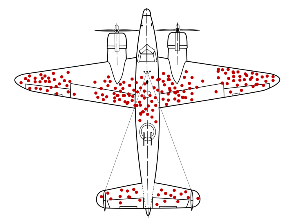
This image has come to represent survivorship bias in general in the meme-language of social media. I’ve actually seen it used twice as a response to a larger topic. It was left without comment and it was intended to mean: “the validity of the statement you just made can be called into question by survivorship bias.” So, if you see this, as I have, without context of any kind, now you know. You’re welcome! This Wikipedia article has lots more examples of survivorship bias.
It’s nice when stories have happy endings; this next one doesn’t. Once upon a time, on January 28, 1986 to be precise, when the space shuttle program was new, school children around the country gathered around classroom TVs to watch the Challenger launch without any sense that failure was a thing that might happen (at least that was my experience of that day). Seriously, I do think the coverage for grownups did talk about the weather and whether the launch would get scrubbed because of low temperatures. As we know, the decision was made to launch and the result was a space shuttle crash and the loss of seven lives. If you are reading this and weren’t alive or old enough to remember in 1986, pretty much everyone who was alive and old enough can tell you where they were when the Challenger went down. I, for example, was watching the launch from Mr. Medeiros’ Latin 1 Class at Abraham Lincoln High School in San Jose, California. What was going on behind the scenes on launch day was concern that the o-rings would fail given the low temperatures. The decision makers looked at data from when the o-rings had failed previously and saw no discernible pattern for failure tied to temperature. What they didn’t look at was the very obvious trend in o-ring failure when success and failure of o-rings were presented together. In hindsight, one can identify that the temperature was a factor in o-ring failure and that not looking at this data resulted in a bad decision being made. A bad decision that resulted in people dying. This has sometimes been referred to as an example of confirmation bias. The assumption being that if the results of their observation of the instances of o-ring failure didn’t affirm their objective to launch immediately, they might have stopped and thought a little bit harder about whether or not they had the right data to make the decision. Whatever the reason, the Challenger disaster is an example of decisions being made without all the facts and the result being a historic disaster on a scale that many of us still remember where we were when it happened. Here’s more info if you’d like to read up on this topic.
Thanks for coming to storytime. Looking for what is missing is a harder skill to get good at because there are so many things that can be left out, but it’s always a good idea to maintain a healthy level of skepticism about what is being left out. Note, this is not the same as suggesting that every dataset is WRONG, and all data should be thrown out, and we shouldn’t trust anything, and that there is no objective truth… but it is always a good idea to poke at the information with which we are presented and just interrogate the way it is presented to us before we file it under “seems legit.” So, for example, when someone tells you that “actually, the police shoot and kill twice as many white people as Black people.” (I will fact check myself and let you know that this is a verifiably true statement). You can stop, think for a minute, and respond with something like: “While it is the truth that more people are shot to death by the police who are white than Black each year, the piece of information you’ve left out of your statement is that only 13% of the US population is Black. Given this fact, Black people are, in fact, disproportionately killed by the police in a significant way. In point of fact, given the numbers you provided more than twice as many Black people are shot and killed by police each year than would be the case were race not a factor in police shootings. Thank you for coming to my Ted Talk.” Missing information changes meaning in very big ways in lots of different circumstances. NOTE: If you want to see the math on this, I can show you. If you start from “twice as many white people are killed by the police than Black” and “13% of the US population is Black (and 76% is white)” it’s just a math problem from there. Ask @JCLS_Tweets if you want to see my work. I saved my scratch paper and everything.
There are a lot of factors at play in the conversation about policing, and data that is left out definitely impacts this beyond the absence of the base population rates mentioned in the last paragraph. There is some presupposition that goes into these arguments since law enforcement will be more likely to find crime where they are looking for it, so Black communities and people become the wings of the plane in our survivorship image if they are scrutinized by the police more thoroughly than other groups. But, as we saw above, this doesn’t necessarily mean this is the most effective location to devote resources.
So, if data collection has bias built into it, how do you use it for coming to conclusions? Is there a genius statistician out there who can do for the policing debate what our WWII era statistician did to save the US military from its own survivorship bias? I hope so because I am in WAY over my head at this point.
And this concludes our mini-series on data… next time: more on confirmation bias and conclusion shopping. Yup, it’s conspiracy theory time!