
Have you ever wondered where the phrase “you can’t judge a book by the cover” came from?
It turns out that before this phrase was popularized by the 1962 Bo Diddley song of the same name, a variation of this phrase first appeared in an 1860 book, The Mill on the Floss, by George Eliot (the pen name of author Mary Ann Evans). And although the Bo Diddley song used the phrase as a metaphor for not judging others, the earlier version meant the phrase literally, saying that one could not judge the merit of a book’s content based on the quality of the binding.
While that might have been good advice at the time, in the modern era of book publishing, artists and publishing houses spend a large amount of time and money creating covers that are meant to be judged. In fact, studies show that human brains create judgements in less than a second. Publishers know this and carefully choose the colors, fonts, imagery, and other details included in cover design to catch your attention, but maybe more importantly, to give you a snapshot of the type of book you can expect to read. Because of these context clues and pattern recognition, covers help romance readers skip over that thriller with the dark cover and sharp sans-serif font in favor of the cartoon couple with pastel colors, and vice versa.
And chances are, your brain is better at recognizing these patterns than you realize. Consider these bestsellers below and see what details the cover gives away:
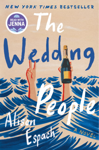
The Wedding People by Alison Espach
- Likely set at the beach/near the ocean
- Features drinking, likely associated with the wedding the title references
- Choppy waves and a drowning character would imply upheaval in the character’s life, as if they were struggling to stay afloat
- A jovial font and carefree peace sign despite the character’s predicament would suggest a dark humor or absurdist comedy element
- “Read with Jenna” stamp in the corner would suggest it’s a decent pick for a book club, likely a conversation starter
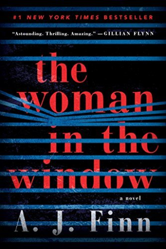
The Woman in the Window, by A.J. Finn
- The blinds evoke a sense of confinement similar to prison bars
- The bend in the blinds suggest someone peeking through, adding a voyeuristic element
- The blue melancholic hues on the inside of the blinds, with the sharp contrast of an almost violent shade of red on black outside, suggests a depressive or isolated state inside, and a danger present outside the window
- Blurb on the cover from Gillian Flynn, a previous bestselling author of psychological thrillers and domestic noirs
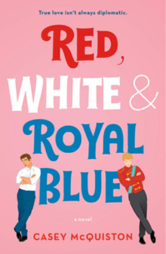
Red, White, & Royal Blue by Casey McQuinston
- Two men on the cover reveals right away that this is a gay romance, and while a bit hard to see at this size, the darker skin tone of one character suggests an interracial couple
- The slight glare both characters give each other would suggest an “enemies-to-lovers” trope
- The “millennial pink” and bold but whimsical font would suggest a rom com for new adults
- The title as well as the tagline at the top might suggest a political theme or setting
- The British regalia on the blonde character shows that one of the two love interests is based in the UK
Did you pick up on some of these clues? Did you notice any details I didn’t mention? Chances are, even if you couldn’t name the font that was used or the meaning behind a color choice, your brain instinctively identified at least a few context clues for these titles. And if you’re a strict romance reader, you probably recognized that The Woman in the Window is not for you, just like The Wedding People is not a good fit for high fantasy readers.
Ultimately, a cover isn’t the only thing to consider before starting a book, but it provides insight faster than reading the synopsis on the back, a handy tool when you have far less time than potential books to read. So next time you’re browsing the library for something great to read, remember that we give you permission to judge a book by its cover. You never know what it might tell you.