When we last “spoke,” I wrote about data and promised to tackle graphical representations of that data next. One of the best ways that the news media has to present large amounts of data is to use graphics. These can take the form of things like colorful maps and graphs. We all learn to read these in elementary school, but we can still be pretty easy to trick with them. And, once again, confirmation bias raises its ugly head because, as I’ve pointed out before, human beings are more likely to accept information that reaffirms the beliefs we already hold. We simply file these images under “seems legit” and carry on. Meanwhile, when we see a graph that leads to conclusions with which we do not agree, we look really closely at them to see if we can get them to fall apart under scrutiny. At least that’s what I do, except for the first bit… I try REALLY, REALLY hard to be aware of my biases, and I look at all graphs and graphics for the same types of shenanigans either way. So, the obvious place to start is with graphical representations of data in general and we are going to start with a graphic many of us have already seen:
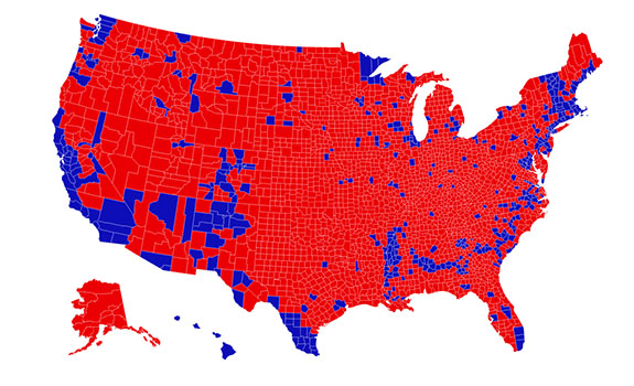
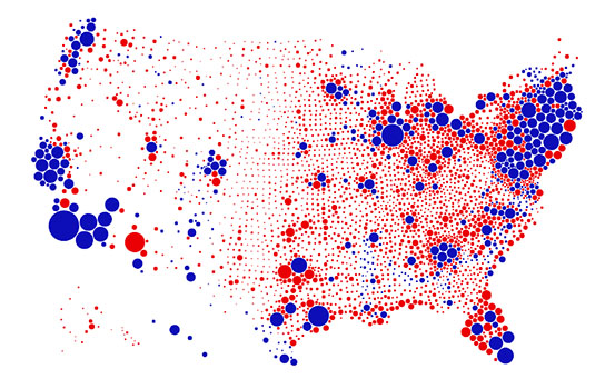
Let’s think about this image and at how easily we can be polarized by it. A lot of us saw this GIF during the past year. It’s a fascinating graphic. The interesting thing is, both of the images provide accurate information from the 2016 presidential election (remember last week we talked about data the importance of our data sources)… AND both of them are misleading in their own ways. One image shows all the counties, colored either red or blue depending on which candidate won the majority of votes there (again, in 2016). The intention of this image seemed to be to show that the majority of the country’s landmass is located in counties in which the majority of voters voted for President Trump in 2016. The other image shows the same counties but adjusts their size to scale them to reflect the total number of votes cast in those counties. The intention of this image was specifically to respond to the viral sharing of the first image (for more on its design, click here). It shows that the majority of the country’s voters voted in counties in which Secretary Clinton won the majority of the votes in the 2016 presidential election. If it feels like that takes a lot of words to explain, that’s why we like graphics for sharing this sort of information; it takes a lot of words to describe the data being presented in a precise enough way to accurately reflect what the creator of the graphic did! But the thing that makes both of these maps misleading is that they both still rely on a binary that doesn’t exist at the county level. To be fair to the creator of the second map, since he was creating it in response to the first map, he built the graphic while understanding its limitations. Some of us may have found one or the other of those maps comforting and stopped thinking about the issue after that. Here’s the thing though: counties don’t vote. Counties are populated by voters who cast votes many different ways, and no county’s election results are 100% one way or the other. The minority voters in all counties are rendered invisible in both of these images. So instead, I encourage you to take a look at this really accessible article from USA Today that broke down some of the inconsistencies in those simplistic maps and shows our country in all its purple glory, this time with data from the 2020 election.
But what about graphs? …because we really were supposed to be doing those this week. Well, some of the thinking we did above works for graphs, too, because ultimately the questions we need to ask ourselves are “what are they trying to convince me of with this graph?” and “are they successfully doing that?” (An aside: not all graphs are designed to convince folks of something specific, but in the news media arena, it is fairly safe to say that someone is trying to make a point with the graph at which they are pointing while they are talking about the unemployment rate or the size of the deficit, etc.) There are things that I always look for when I see a graph. Admittedly, these can be hard to check when they are splashed up on a TV screen for a short period of time (particularly when your eyes are getting older and less effective at doing their job, like mine are). We rely a lot on the words that are said while the image is up to inform how we see it, and our brain does that “seems legit” trick it does when we hear information that we are already inclined to accept as true. This is why misleading graphs can be so easily used in television media specifically. So, here’s the crux of it: yeah, where the data comes from is important… but when looking at graphs the MOST important thing to look at is HOW IT IS LABELED. Simple as that. The biggest offender is typically what’s called the y-axis of both bar and line style graphs. That’s the vertical line that is most often on the far-left side of the graph. There are two really easy ways to use the y-axis to mislead: by playing with the scale and by making the baseline of the y-axis a number other than zero. There are some other tricks as well, and I found a simple article that shows the main ways really simply without pulling from either “side” of the bias discussion.
The point here is: consume graphics with caution… and if you find you are looking at a graph and doing the “seems legit” thing, just look a little closer and ask a few questions before letting yourself be comforted by it.
I think we all know that with news media, in particular, it can be easier to convey complex stories if they are simplified, but sometimes this simplification leaves a lot out… and that, too, can be a blind spot for many of us. More on this next time.